First Page
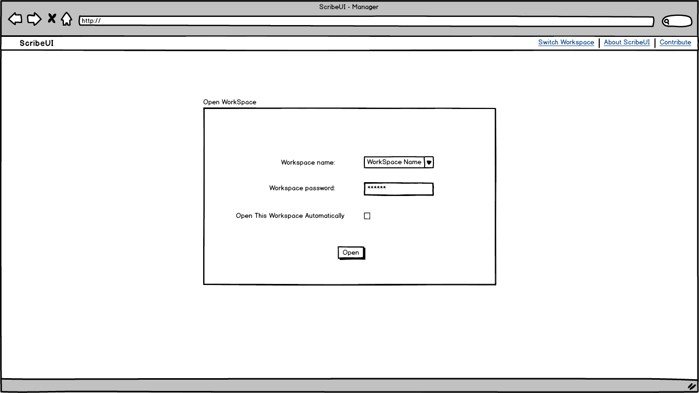
When the app is first opened, the app asks for a workspace to work on. The workspaces allow ScribeUI to be cloud-based, with each user or project having its own workspace.
Manager
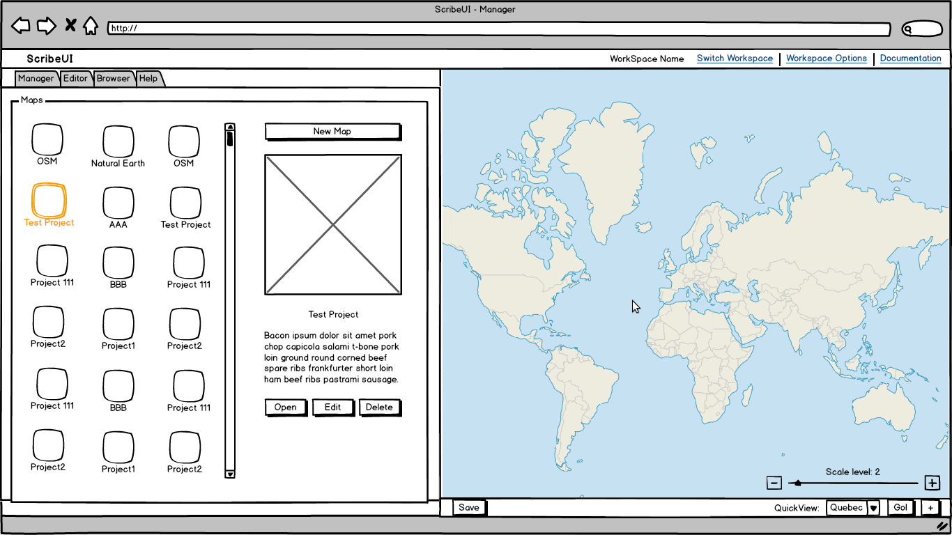
The manager lists the maps withing the project. The icons will be snapshots of the map. The toolbar at the bottom of the map is accessible from anywhere. The quickview is very useful, as it allows the user to save and quickly get back to certain map extents.
Editor
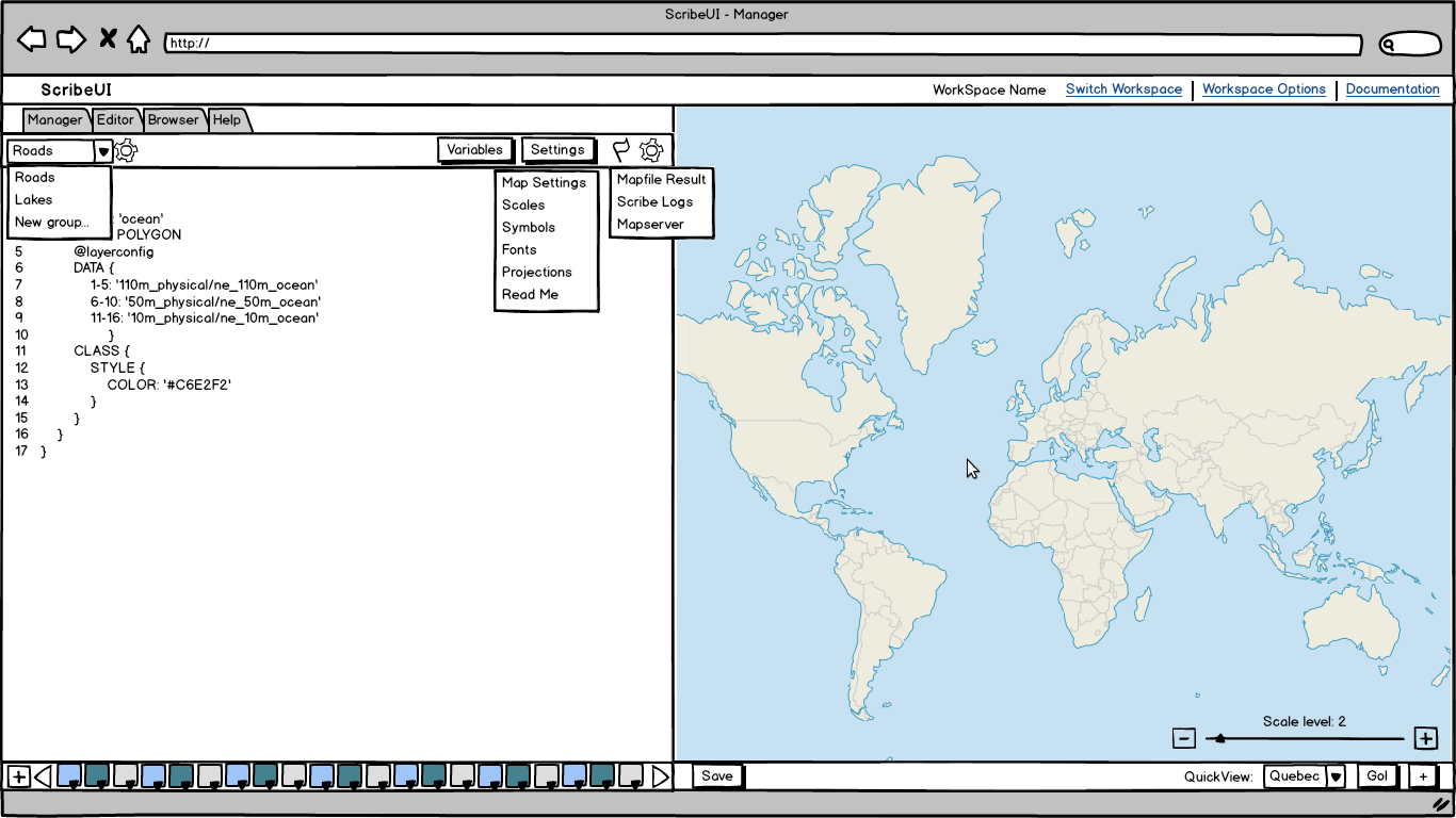
 This is the most important part of the app. The toolbar on top of the text box contains most tools for the mapfile edition.
Layer Groups: Choose the currently edited layer group from the drop-down. Group order and deletion managed in a pop-up appearing when the user clicks on the icon next to the drop-down.
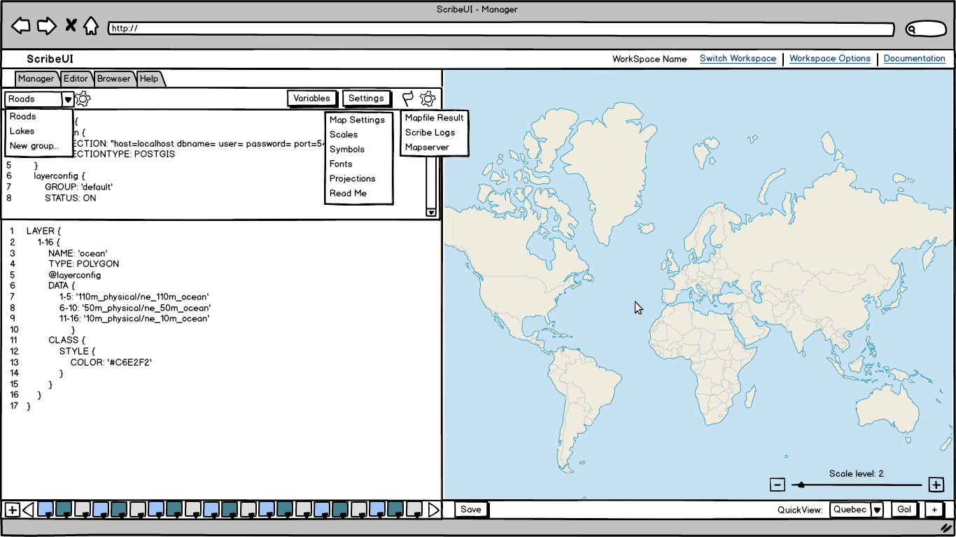
Variables: Opens a panel on top of the regular editor. It contains the map’s variables, if the project is in Scribe.
Settings: This drop-down contains editable sections of the map project.
Debug: The flag icon opens a list of debugs links. Mapfile Result is the outputted mapfile, Scribe logs contains log messages from Scribe and Mapserver Debug contains the debug output from mapserver.
Editor Settings: The gear icon will allow the user to edit the editor’s configuration.
Swatch Toolbar: The swatches at the bottom of the editor allow the user to edit the project’s colors with a color picker.
Editable Panel
When a user clicks on one of the settings option, or on the variable button, a panel opens that allows the edition of that particular setting.
A big thanks to the people from Balsamiq who gave a licence for their mockups software to this GSoC project !


